Wednesday, July 30, 2014

Designing the Life I Dream Of

So, in my "About Me" section, you might have noticed that I said I post about "my quest to design the life I dream of."  Mostly I've just posted about design stuff so far, but today is the day.  I had a little bit of an epiphany the other day.  I'd been daydreaming about living on a farm (not WORKING the farm), having a little garden, animals, a slower pace...  I'd still love to do that, but here is the epiphany.  Why wait to have the life I dream of?  So, I don't live on a farm and my garden gets eaten by deer.  What else can I do to be happy NOW and not in some dream of a life I may never have?

I've been thinking about it and I've found a few things that are important for me to be happy and stay out of the day to day rut.  You might need different things.  Here are some of mine.  I'm sure I'll come up with more the more that I think about it.

1. Me time.  I need me time.  Not a lot, but some.  EVERY DAY.  It might be a 25 minute workout in front of the TV (T25 anyone?), maybe a trip to the gym, yoga, maybe even a pedicure.  It doesn't really matter what it is, as long as I can focus on it for a little while and feel recharged after.  Quite often, this is easier said than done.  Me time does NOT include folding laundry, going to the grocery store (especially with kids), work, or cleaning.  It's nice if I can combine it with something active, because I surely need more of that.

2. A creative outlet.  I need to be doing something creative.  Sometimes this includes designing new rooms for me or my friends.  Sometimes it might be sewing a quilt.  (I've done that twice now.)  It could be putting Hannah and Lucy's fall wardrobes together on Polyvore.  It's so much more fun to dress them than it is to dress me.  This creative outlet happens for me automatically.  I can't help designing things in my mind.  Thinking about how I would change or improve a place that I go, or how I can incorporate great details that I see into my rooms.

3. I need to get out of my comfort zone.  This is more for the "stay out of the day to day rut" part.  I have a hard time with this.  For one, I'm super busy with two kids, one who is still a toddler.  I work, I have a blog (maybe you've heard of it?), I try to exercise regularly, I attempt to prepare healthy meals for my family THAT THEY WILL EAT.  But it's also difficult because I'm not really a dare devil type of girl.  I've always been more of a watch from the sidelines type of girl.  But you know what?  That is lame.  I'm missing out on a lot of fun just watching from the sidelines.  You gotta get in there, you know?  Get your hands dirty.  So I've been trying to say "yes" to things that might sound like too much effort or might seem a little bit intimidating.  It's been fun!

Today I did SUP yoga.  What is that you ask?  It's yoga on a Stand Up Paddleboard.  I have a friend who is really good at getting her hands dirty.  She's super active and doesn't seem intimidated by much.  She has her own Yoga and Pilates company that does SUP yoga.  It's called Wasatch Yoga and Pilates and she's on Facebook.  Look her up there.  I saw some pictures she posted and I thought, "Ohhh!  That looks like fun!"  But then I thought, "I can't do that!  I've never even done SUP before.  What if I'm terrible?  What if I spend the entire time in the water?  What if everyone can tell what a dork I am?"  And then, I signed up.  Guess what?  It was fun!  I only fell in once and it wasn't so bad.  I wasn't the only one who fell in either.  Don't know if they could tell what a dork I am, but who cares, right?  I think I'm going to go again!


Here's another thing I might not have been THAT psyched to do.  Go on a hike with my family for Pioneer Day.  We have two little girls that fight a lot in the car, they make it hard to get up and do stuff.  And they MIGHT complain a bit while hiking the 1 mile trail up to Cecret Lake.  But...  we did it!  And it was fun!  And I think maybe they learned something about getting off the beaten path.  About the rewards of going out of your way a little bit to see something not everyone gets to see.  That it won't kill you to get out of breath and to feel your leg muscles working.  At least I hope they did.


Monday, July 28, 2014

My very own living room

I'm posting some the rooms in my house at the request of some of my followers.  Today I'm going to share my living room with you.  I did it about 7 years ago when we moved into this house and actually, I already had most of the furniture from my other house.


It is my belief that you don't have to spend a fortune on every single item that goes into a room.  But I also think that spending a little more money on a few key pieces can help the entire room look a little bit more expensive or higher end.  In this case, the yellow chairs were custom made pieces.  They are beautiful and really high quality.  On the other hand, the rug is just a sisal rug from Tai Pan Trading Company and the sofa is real leather from Ashley Furniture (read super affordable).


I chose a very soft pallet of gold and green with a lot of neutrals.  I picked up all of the pillows at Pottery Barn.  Pillows are a requirement for me, but especially on a leather sofa.  Leather can be a bit heavy, dark, and masculine and the pillows really help to balance that out.  I already owned the tree artwork and had used it in my office at work.  It wasn't big enough to put over the sofa by itself, so I needed to find a couple of other items to make a grouping.  The black framed wooden design on the bottom left from ZGallery and the basket tray from Rod Works fit the bill.


The living room in my new house is less than half the size of my old one, so some items didn't fit in my new living room.  Here is a view from my living room into the entryway of my house.  I have always loved this hutch from Ethan Allen and love that I found a spot for it in my entry.  (My front door is on the right)  Don't forget the tops of your furniture items like this.  Especially with high ceilings like I have, they need a little something to soften the hard lines and draw your eye up.  

Friday, July 25, 2014

Today on my Pinterest Feed

Are you on Pinterest?  What does your feed look like?  Mine is a random compilation of clothes, food, workouts, kid stuff, and of course interior design.  I'm just going to share a couple of my favorites showing up on my feed today.


I love barn style doors.  These ones are so dang fancy, I'm not sure they can still be considered "barn" doors, but oh, aren't they lovely?  This room was designed by Martha O'Hara Interiors based in Austin, TX.  I love how the overall feeling is refined and soft, but there are still some bold choices like the dining room wall color and of course the grand barn doors.  Here is a link to her page. http://oharainteriors.com/project-gallery/mn-builders-office/


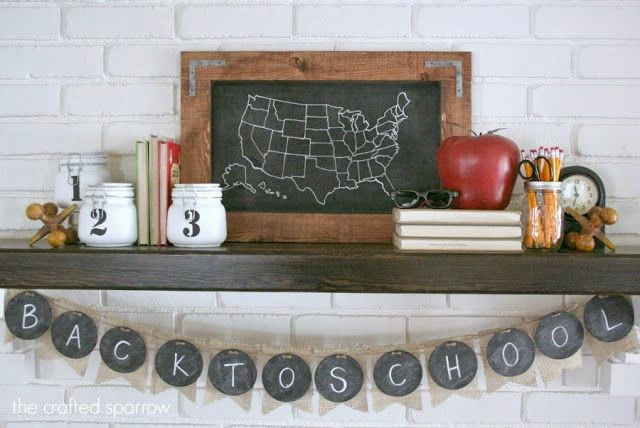
I'm also starting to have a bunch of back to school items appear.  It's too soon!!!  I'm not ready, but I pinned this cute display so I can revisit it in September after my kids have already been in school for 2 weeks. 


Isn't this adorable?  I love everything about it.  The books, the large wooden jacks, the chalk board map and banner, the huge apple, jars, pencils, clock...  I think my favorite little detail is the glasses.  So fun!  It's by The Crafted Sparrow.  Here is a link to the blog.  http://www.thecraftedsparrow.com/2013/08/back-to-school-mantle.html


This one has nothing to do with design, but I just took Hannah to Mary Poppins at Hale Theater the other day.  It was so good!  I might actually stick Lucy in this for Halloween while I still have a little bit of influence.


Oh my gosh!!  Have you ever seen anything so cute??  I'm dying!!  The link from Pinterest was broken, so here is the link to the Pinterest Page.  http://www.pinterest.com/pin/14284923792799409/


Thursday, July 24, 2014

Thrifty Thursday Boys Room

So, I have two girls.  I don't get the opportunity to do a lot of boy's rooms.  I saw this room that was done by Alice Lane (can you tell that I love them?) and I loved it and thought I could do it on the cheap.

I did my room design with a twin bed because I think that is more common for a kids room, but everything I found for the bed can also be purchased in a queen size.

Thrifty Thursday Boys Room


I suggest using white sheets and this blanket from Pottery Barn Teen in place of the navy striped quilt.  For some reason Pottery Barn Teen won't allow me to clip images into Polyvore, so I
couldn't include it in the image.  Turn down the sheet and blanket and then fold the duvet down to show the blanket.


The artwork could be a bit tricky to copy, but I did find this fun print available on Etsy.   https://www.etsy.com/listing/112444487/original-collage-on-paper-costa-rica-map?utm_source=OpenGraph&utm_medium=PageTools&utm_campaign=Share
Original Collage on Paper Costa Rica Map Decor Travel Bug Art Vacation Insect Art

So here is the run down on prices.
Bed $296 from Wayfair.com.  The Queen size was the same price.
Blanket $59  from Pottery Barn Teen
Duvet Cover $29.99 from Ikea
White Euro Sham $8.70 from Wayfair.com
White Dust Ruffle $15.00 from Wayfair.com
Pillow $24 from West Elm
Orange Lamp $124 from JCPenney
Silver Floor Lamp $199 from Pottery Barn
Crank Table $279 from Wayfair.com
Rug $112 from Rugsusa.com
Bug Print $25 from dadadreams on Etsy.com

Wednesday, July 23, 2014

Lucy's room

I had a request to show some more of the rooms in my house.  I'm holding out on my master bedroom until it's all finished, so I'll pick some other rooms to share with you.  It's hard to pick because they are all a work in progress and many of them I did 7 years ago when I moved into our house, so they don't necessarily reflect what I'm doing right now.  But I still like them and think you might like to see.  

Today we're looking at Lucy's room.  Hannah got a new room when I had Lucy, so I had many pieces I wanted to use from Hannah's nursery in Lucy's room.  But, I wanted Lucy to have some things that were just hers, so I picked a few new items to mix in with what I already had.


So Hannah's nursery was pink, cream, and brown.  The walls were already pink, I already had the crib and dresser, and I had the three frames on the wall (with different pictures).  I rewired and painted an old chandelier that was given to me by my sister in-law.


I got Lucy new bedding from Pottery Barn Kids, new flower artwork and new drapes.  The flowers are painted on wood and the hooks and ribbons were already there.  When I went to hang the new pictures up, they were too small and looked too far apart.  So I took the old frames I had, took out the glass, spray painted them a bright turquoise color, and hung the new pictures up inside the old frames.


Okay, so this is where you see that this is a room we LIVE in and not a model home.  Please don't judge the grungy old glider.  The quilt on the back of the chair was from Hannah's old crib set.  I found the dresser at a consignment store when I was pregnant with Hannah, painted it in a random stripe pattern and added crystal knobs from Restoration Hardware.  The bookshelf is from Land of Nod and the pillow is from Pottery Barn Kids.

And there you go, with just a few new items, we changed from a very lovely soft, pink, cream, and brown nursery for Hannah, to a brighter more colorful nursery for Lucy.

If you aren't happy with a room, or even just want something different, there's no need to scrap the whole thing and start over.  With just a few new or different items, you can change the entire look and feel of a room.  


Tuesday, July 22, 2014

New show - Flipping the Block

Did you watch HGTV's new show Flipping the Block on Sunday night?  I did.  So the deal is, there are 4 teams, they each got an identical condominium unit to renovate and the same budget.  Each week, they will renovate a specific room.  At the end, each condo will be auctioned off and the team that makes the most money wins!  Do you have a favorite team yet?  I do!!

But before I tell you who I'm rooting for, let's critique the rooms, shall we?  Now, before I even start, I want to say, I DO understand they only had 4 days and these rooms were in ROUGH shape.  So maybe they would have done things differently if they had more time.  That being said, we are looking at the finished product here.


This room was done by sisters, Anicka and Shauna.  Here is what I like.  I like the neutral wall color and dark wood floor.  I like the bright orange that they pulled in through the bedspread and pouf/ottoman.  I like the head board, chair, and sunburst mirror. 

 Here is what I would change.  The drapes are hung too low.  This is what EVERY team did - if they even had window treatments at all.  The drapes would look much better if they hung them higher up to the ceiling.  I also think they missed an opportunity to make a statement with the drapes.  The wall color is neutral the headboard is neutral, and they really could have done something more with the drapes.  The lamp next to the bed is too low.


This little corner on the left turned out cute.  I love the dresser and lamp.  I wish the artwork was a little bigger, though.

The next team was Amanda and Curtis.  Curtis claims to be the handy man and Amanda the design expert.  I don't want to be rude, but...  Well, I"ll just show you their room.

Ack!!  Is it just me?  There is just TOO MUCH going on in this room.  Were they trying to see how many gray geometric patterns they could use in one room?  There is one on the bedspread, a different one on the throw pillows, another on the rug, another on the drapes, and then another painted on on the dresser (that is not visible in the pictures).  I also don't think the bead board wainscotting was the best way to go here.  I like bead board, but it's very cottage/country and doesn't compliment the glamorous look that I think she was going for.  And again, the drapes should have been hung higher and wider, so as to not cover up so much of the window.  

Next up is Brian and Craig.  They are twin brothers from Texas.  

Looks like a bachelor pad.  Where to even start?  None of the furniture compliments each other.  I don't really like matching "bedroom sets", but I think they make them for these guys.  Putting mismatched items together takes skill and I don't think they have it.  I hate the naked windows, lime sherbet green wall, every single accessory...  

The last team is John and Whitney.  They are a young, married couple.  

I like the bright, fresh color scheme with the turquoise and yellow.  The chevron drapes are very current, but they need to be hung HIGHER.  They did at least hang them on the outside of the window.  But, is that a copper pipe they are hung on?  And what happened to the bed?  Pillows anyone?  The bottom of the headboard is visible and I hate that, but a couple of standard pillows stacked up on each side would have hidden that and looked so much better.  I'm also not a fan of the throw pillow in the middle.  The table isn't great, but would work if it was pulled closer to the bed and the hanging light should also be closer to the bed.  It's not useful at all over in the corner.  


I like the dresser, but it's a bit small, and the chair is doing nothing for me.  I don't love the paint treatment, but I do like the yellow mirror even though it is hung a little too high.  The barn doors on the closet are a great idea.  I might have chosen a more rustic looking one for a little texture and interest.

Which room was your favorite?  Mine was by far the first one by Anicka and Shauna, so they are my favorite team going forward.  Over all, I don't know if this show will be a great one for interior design inspiration, but it is fun and entertaining to watch them scramble.  Also, Nicole Curtis from Rehab Addict is one of the judges, and I love her, so that's cool.


Monday, July 21, 2014

A little bit about curb appeal


I love it when I'm driving around and a house just catches my eye.  Sometimes it's the architecture, but often it's the landscaping and how it's all put together.  You can't easily change the architecture of your house, but you can make the best of it with great landscaping, and a couple of other little tricks.


My house has a large driveway and three car garage.  The house is situated on the lot in order to best take advantage of the valley and mountain views out the back of the house.  From the front, that means that the garage and driveway are VERY prominent.  It's not ideal, but we had to choose what was most important, the views or the curb appeal.  We picked the views because that's one of the reasons we chose our lot.  That means I just have to work with the overbearing driveway and garage.  

First, I chose carriage style doors that could be stained or painted to blend in with the colors of the house.  In this case, I chose to paint them to BLEND in with the house rather than make them stand out even more than they do by staining them.  I love stained garage doors, but in this instance, I think the paint works better.

I also soften all the concrete of the driveway by flanking each side of the garage with large flower pots.  I took several short cuts on my flower pots because that's just what I do.  First, I wanted copper pots to compliment the mountain/craftsman style of the house.  I found several online, but they are spendy, so I made my own.  

I went to Ikea and bought a bunch of these galvanized pots.  The ones I use by my garage are actually taller than this one pictured above.  Then, I grabbed some of the Hammered Copper Rust-Oleum paint I already had on hand.  The pots didn't have drainage holes in them, so we drilled a hole in the bottom, painted it, and... Ta Da!!

The other shortcut I took is that instead of planting my own pots, I ran down to the local flower store, Draper Flower Pros.  They had a TON of hanging baskets for $24.99-$29.99 in all kinds of color combinations.  They were all gorgeous and HUGE!!  So, I grabbed some.  I just fill up my planters with rocks in the bottom to keep them from tipping over, then soil, then the hanging basket just sits right on top. I just cut off the plastic hanging part.  It makes it easier to turn the flowers if they need it and I didn't have to wait for them to fill in.  

My next tip is to have a "destination" or seating area that draws you into the yard.  My kids actually use our front area to play more than our backyard, so it makes sense for me to have a seating area out front, so I can watch them.  I asked Nate for these adirondack chairs for Mother's Day.  They are from World Market and I love them!  So cute and comfortable.  

My last tip is to focus on the entry.  Add a wreath, some flower pots, and something of interest to welcome people into your home.  I also love a brightly painted door, if it fits with your house.  My house is already pretty colorful with the red window trim, so I opted for the stained wood door.

You also need a cute doormat.  I got this one at World Market last year.  If your front stoop or porch is big enough, a chair or a little bistro set is also super cute and welcoming.  

Curb appeal not only positively affects the value of your home, but also affects how you feel about it.  I love to pull up to my house and see those pretty flowers and comfy chairs calling my name.  It's a great welcome home.


Friday, July 18, 2014

Designer Spotlight - Magnolia by Chip and Joanna Gaines

So, it might seem strange, but I plan to spotlight OTHER designers on my blog.  I don't pretend to be the only one around with good ideas.  One of my favorite channels is HGTV.  If you're reading this, chances are you might like it too.  

I have a new favorite show on HGTV.  It's called Fixer Upper.  Have you seen it yet?  It's just great for so many reasons!  For one thing, the hosts, husband and wife team, Chip and Joanna Gaines, are just adorable.  Joanna does all the design and Chip does all the dirty work.  They are not only incredibly talented, but super cute together.  Second, they are based out of Waco, Texas.  I would not have thought this would be a good thing, but I'm telling you, IT IS!  Their clients buy these beautiful but often totally dilapidated historical homes for like $60,000.00.  You can't even get a trailer for that around here.  Then they put $100,000.00 or so into it and voila, gorgeousness ensues!!  Check out the project from episode 1.

Magnolia remodel by Chip and Joanna Gaines


Fixer Upper Episode One - Magnolia Homes
magnoliahomes.net


There are even more beautiful rooms featured in this home.  And everything they do is just as good.  I love how they makeover the entire house, outside, inside, top to bottom.  I would describe her style as a bit shabby chic meets industrial farmhouse.  I love it.  All the episodes are available right now On Demand, if you have Comcast.  They also have an great website and blog.  Go check it out!
http://magnoliahomes.net/blog/

Thursday, July 17, 2014

It's Thrifty Thursday!!!


Have you ever found a piece of furniture that you LOVE, but you just can't justify the price?  It happens to me all the time.  The great thing is, that most of the time, you can find a similar look on a budget.  I truly believe that some things are worth the high price tag, if you can afford it.  But what if you can't?  Or even if you just don't want to?  I'm here to help, with 5 gorgeous finds on a dime.


Hi/Low Spindle Chair


I fell in love with a chair just like this one on the left at Alice Lane in Provo a couple of years ago.  I love the interest of the spindles.  It's classic and architectural all at the same time.  The one on the left is from Horchow and it costs $1,799.00.  Now I'm not saying that it's not worth it.  There are differences between the two chairs.  It looks like the one on the left has a thicker, more dense foam cushion on the seat.  It also has extra details like the nail head trim around the bottom.  And there are also several fabric options to choose from.  

But, if you can live without those, the one on the left is for you.  It's from ZGallery and it's $599.00.  The ottoman is $299.00, but if we're comparing just the chairs for a moment, that's a savings of $1,200.00!!  Both of these chairs are also lovely from the back, so don't waste it by putting them up against a wall.  Keep scrolling down to see the other four items I found.
Are you in the market for a new dining table?  I love both of these.  They each extend to seat at least 8.  I love the hefty look of the legs and the rough look of the wood.  It looks like a few scratches on the table would just add to the worn look.  That's my kind of table.

high/low dining table


The one on the left is a wonderful option from Restoration Hardware.  It's usually $2,495.00 but it's on sale right now for $1,945.00.  There are several size and finish options.  It's lovely and totally worth the money.  

But I don't have that much on hand for a table right now.  I just bought a bunch of bedroom furniture, so the one on the right would be a better option for me.  It is from World Market and it's $699.99.  I've seen this table in person.  It's a solid, heavy duty table and very pretty.  If you buy the World Market table, you will save $1,245.01!  Keep on scrolling to see the chairs I picked to go with the table.