But before I tell you who I'm rooting for, let's critique the rooms, shall we? Now, before I even start, I want to say, I DO understand they only had 4 days and these rooms were in ROUGH shape. So maybe they would have done things differently if they had more time. That being said, we are looking at the finished product here.
This room was done by sisters, Anicka and Shauna. Here is what I like. I like the neutral wall color and dark wood floor. I like the bright orange that they pulled in through the bedspread and pouf/ottoman. I like the head board, chair, and sunburst mirror.
Here is what I would change. The drapes are hung too low. This is what EVERY team did - if they even had window treatments at all. The drapes would look much better if they hung them higher up to the ceiling. I also think they missed an opportunity to make a statement with the drapes. The wall color is neutral the headboard is neutral, and they really could have done something more with the drapes. The lamp next to the bed is too low.

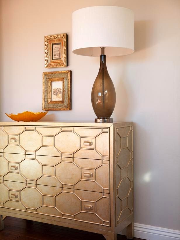
This little corner on the left turned out cute. I love the dresser and lamp. I wish the artwork was a little bigger, though.
The next team was Amanda and Curtis. Curtis claims to be the handy man and Amanda the design expert. I don't want to be rude, but... Well, I"ll just show you their room.
Ack!! Is it just me? There is just TOO MUCH going on in this room. Were they trying to see how many gray geometric patterns they could use in one room? There is one on the bedspread, a different one on the throw pillows, another on the rug, another on the drapes, and then another painted on on the dresser (that is not visible in the pictures). I also don't think the bead board wainscotting was the best way to go here. I like bead board, but it's very cottage/country and doesn't compliment the glamorous look that I think she was going for. And again, the drapes should have been hung higher and wider, so as to not cover up so much of the window.
Next up is Brian and Craig. They are twin brothers from Texas.
Looks like a bachelor pad. Where to even start? None of the furniture compliments each other. I don't really like matching "bedroom sets", but I think they make them for these guys. Putting mismatched items together takes skill and I don't think they have it. I hate the naked windows, lime sherbet green wall, every single accessory...
The last team is John and Whitney. They are a young, married couple.
I like the bright, fresh color scheme with the turquoise and yellow. The chevron drapes are very current, but they need to be hung HIGHER. They did at least hang them on the outside of the window. But, is that a copper pipe they are hung on? And what happened to the bed? Pillows anyone? The bottom of the headboard is visible and I hate that, but a couple of standard pillows stacked up on each side would have hidden that and looked so much better. I'm also not a fan of the throw pillow in the middle. The table isn't great, but would work if it was pulled closer to the bed and the hanging light should also be closer to the bed. It's not useful at all over in the corner.

I like the dresser, but it's a bit small, and the chair is doing nothing for me. I don't love the paint treatment, but I do like the yellow mirror even though it is hung a little too high. The barn doors on the closet are a great idea. I might have chosen a more rustic looking one for a little texture and interest.
Which room was your favorite? Mine was by far the first one by Anicka and Shauna, so they are my favorite team going forward. Over all, I don't know if this show will be a great one for interior design inspiration, but it is fun and entertaining to watch them scramble. Also, Nicole Curtis from Rehab Addict is one of the judges, and I love her, so that's cool.


Ummmm, none of those rooms were good. I agree, I'd choose room one, and you're absolutely right about the drapes. Wow! Maybe you and I should get on this show.
ReplyDelete